Few surfboard brands carry the same weight as DHD. Founded by Gold Coast shaper Darren Handley, DHD has built its reputation on performance-driven design, craftsmanship, and long-standing relationships with some of the world’s best surfers. From Mick Fanning’s world titles to a new generation of elite team riders like Ethan Ewing, the brand has always let the boards and the people behind them do the talking.
That philosophy carries naturally into DHD’s welcome email.
Welcome emails play a critical role in email marketing. They set expectations, establish brand tone, and begin the relationship between brand and subscriber. When done well, they build trust before asking for anything in return. DHD’s welcome email largely succeeds in this regard, offering a considered, brand-first introduction that prioritises credibility, story and craft over aggressive selling, with a few opportunities to push it even further.
What DHD Gets Right
From the first scroll, the branding is unmistakably DHD. The black-and-white colour palette appears immediately and remains consistent throughout the email, reinforcing the brand’s stripped-back, no-nonsense identity. Their distinct brand font is used confidently across the header, headings and subheadings, creating strong visual cohesion.
The hero image is a standout. Featuring Darren Handley inside his shaping bay, shot in black and white, it instantly anchors the email in authenticity and craft.

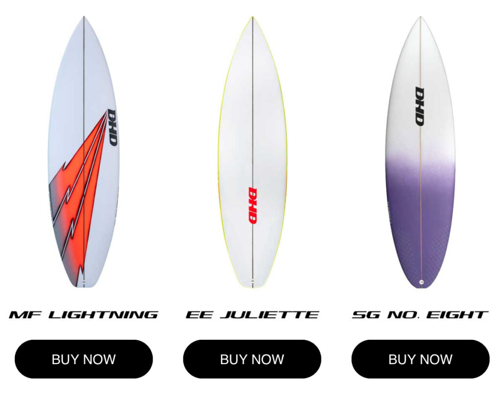
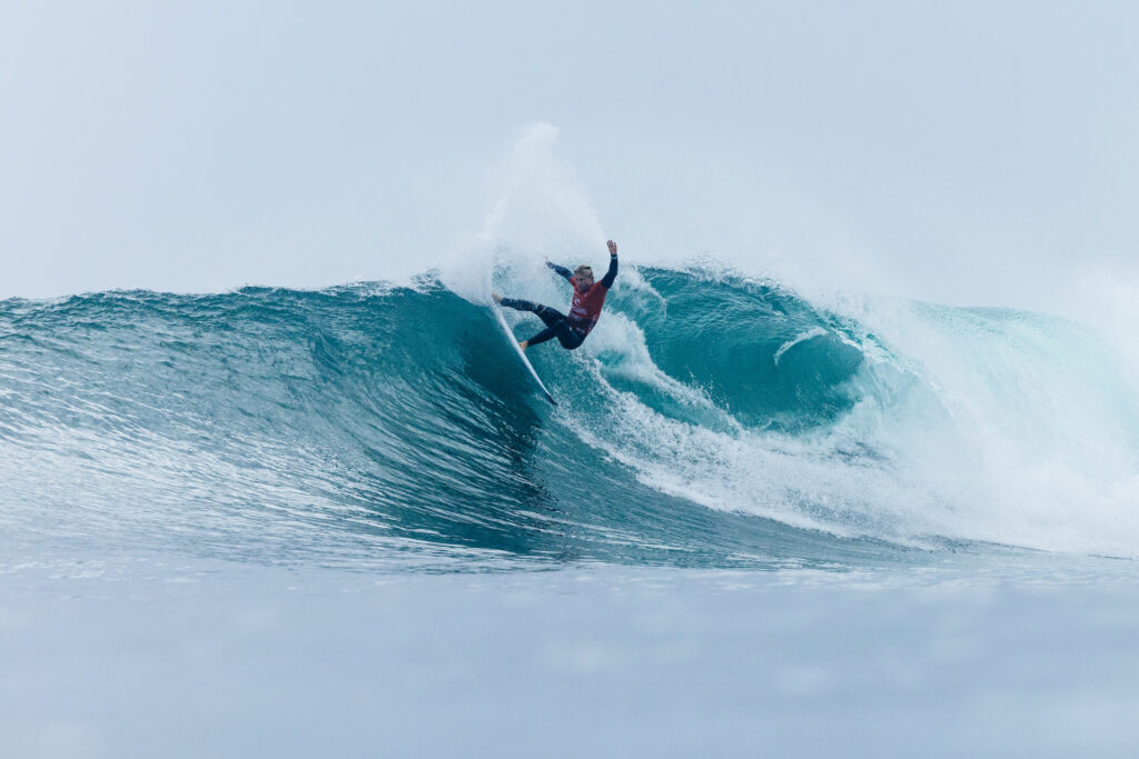
The email is refreshingly restrained in its use of imagery. Rather than overwhelming the reader, it features just a handful of visuals which include Darren in the bay, a team rider shot of Mick Fanning at Dbah, and imagery of their three key surfboard models. This keeps the layout clean and ensures the email remains easy to scan.
The copy itself is well-spaced and skimmable without losing substance. It touches on DHD’s key selling point – local, award-winning Gold Coast shapes trusted by elite surfers – while lightly introducing the brand’s story. Importantly, the tone leans editorial rather than transactional. It feels shaper-driven, reflecting Darren’s authority and experience.
Strategically placed links to DHD’s top three surfboard models guide readers toward product exploration without overpowering the narrative. The footer is simple and functional with links to DHD’s Instagram, Facebook and YouTube.
Opportunities to Go Further
While the email mentions what subscribers can expect – including “access to inside stories” – this could be made clearer. Linking to existing feature stories, edits or interviews would better demonstrate the value of being on the list and help reduce early unsubscribes.
There’s also a minor inconsistency in typography, with the introduction using a different font to the rest of the body copy. While subtle, consistency matters in brand-led communication.
From a CTA perspective, the only clear calls to action are “Buy” buttons at the bottom of the email. These feel overly explicit for a welcome touchpoint. Softer, exploratory language such as “Find your board” or “Check this out” would better align with the tone. Additional CTAs could direct readers to evergreen content such as Darren’s shaping philosophy or the team riders – catering to both product-focused and story-driven subscribers.
There’s also room to experiment with richer media. A short, well-compressed GIF – perhaps a succinct clip of Ethan Ewing at Bells – could add movement without compromising deliverability.
On the technical side, the email performs strongly. It uses first-name personalisation, is extremely mobile-friendly, and strikes an excellent image-to-text balance. Importantly, it leads with emotion and craft before product.
What I’d Test Next
Future optimisation could include collecting additional signup data such as surfing stance or ability level, enabling more personalised content and product recommendations over time. A/B testing hero imagery (Darren versus team riders), static images versus short GIFs, and experimenting with CTA placement above the fold would all provide valuable insights.
Wrap Up
DHD’s welcome email succeeds because it understands its role; not to convert immediately, but to introduce the brand on its own terms. By prioritising craft, authenticity and story, it builds trust first – exactly what a heritage surf brand should do. With clearer value signalling, softer CTAs and richer content pathways, it could evolve from a strong introduction into a powerful long-term engagement tool.


Well written Riley and easy to read. Well versed in marketing. Maybe they need to engage you.
Cheers dad, I wouldn’t say no to that!